New finds from the West Coast Art and Frame Show (Part One)
So, back in January Mike went to the West Coast Art and
Frame show in Fabulous Las Vegas. Before
he left, he asked me what to look for (aside from all new backroom equipment)
and I said find me ‘the new hotness’ or ‘the next big thing’. I was
nervous to see what he actually brought back, and the wait is finally over. All of the new corner samples finally
arrived, and WOW, they are awesome! Here’s a sneak peak:
These are the 'Car Finish' frames by Direct Moulding: glittery, glossy, and available in a range of neutrals, these would look great on a bathroom mirror, a photo of your sports car, or could even be a modern take on a diploma frame!
Trust me when I say these look even cooler in person, so stop by and check them out.


 Check out these acrylic frames! This line of frames is the epitome of custom framing, available in a huge array of colors, matte and clear finishes, and even molded backgrounds. Go fun with brights, classic with neutrals, even preppy with red, white and blue.

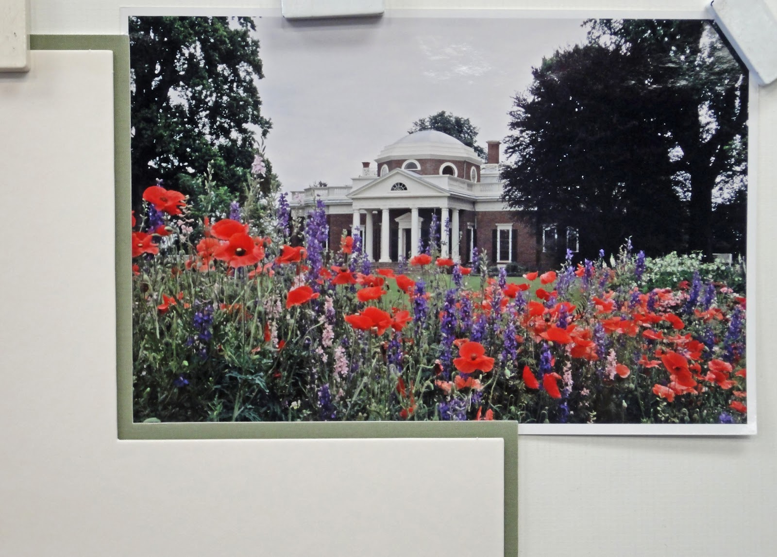 Match the mat colors to something in your picture: I know this seems pretty obvious, but it’s probably the most important rule. The whole project may not look bad with mats that don’t match the picture, but you will notice something off about it and it will bug you all the time.

 Choose your colors in proportion to how they appear in the picture. Sometimes your favorite part of a picture is the smallest, like a tiny flower or a streak in water or a shadow that is the perfect color. Choosing a top mat to match a small feature will often feel like it doesn’t match, because the ratio of that color in the art and the mat isn’t the same. Top mats need to be either a neutral, pleasing color (white, black, gray) or a color that appears in a large part of the artwork. The color of that perfect feature will work as an accent mat!