Choosing mat colors 101
I think a lot of people are intimidated by choosing mat colors for their artwork, and it can be scary. The wrong mat can call attention to the wrong part of your picture and look terrible in your house. Here are some tips for choosing the perfect matting every time!
 Match the mat colors to something in your picture: I know this seems pretty obvious, but it’s probably the most important rule. The whole project may not look bad with mats that don’t match the picture, but you will notice something off about it and it will bug you all the time.
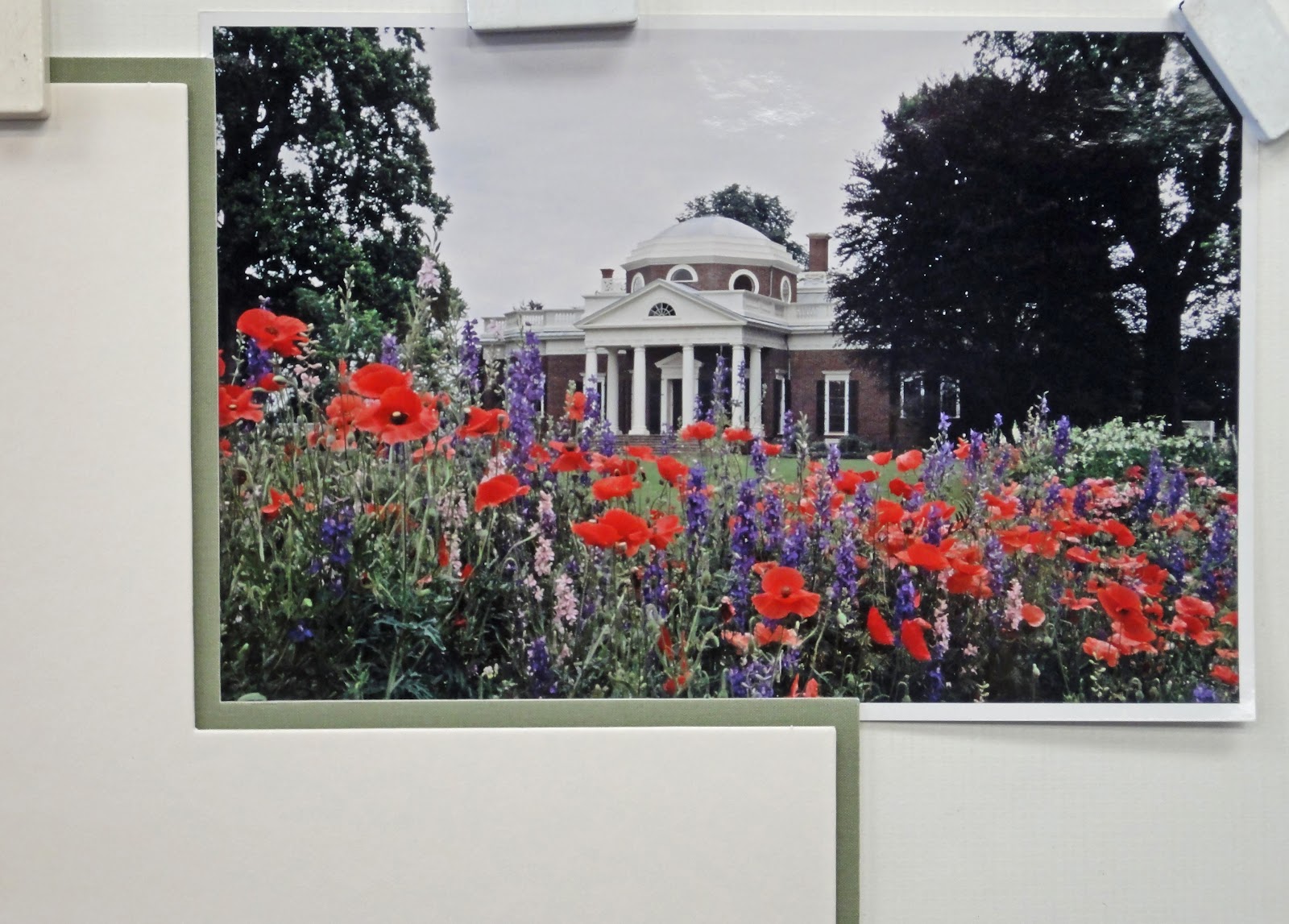
Make a decision about which part of the picture to highlight: Photos like the one in the examples here are very colorful and calling attention to a portion of the picture will take focus away from another. Again, seems obvious, but take a look at the bright green/orange/purple matting example, it’s really hard to see Monticello in the background because you are focusing on the garden. In the brown and green example, Monticello stands out more, as it does in the examples with white top mats.

 Choose your colors in proportion to how they appear in the picture. Sometimes your favorite part of a picture is the smallest, like a tiny flower or a streak in water or a shadow that is the perfect color. Choosing a top mat to match a small feature will often feel like it doesn’t match, because the ratio of that color in the art and the mat isn’t the same. Top mats need to be either a neutral, pleasing color (white, black, gray) or a color that appears in a large part of the artwork. The color of that perfect feature will work as an accent mat!
When all else fails, choosing a neutral mat will always work! White or light colored matting works on all pictures because they don’t call your attention to any specific part of the picture and they will look good in anyone’s home or office. The example with the double white mat would be perfect for a gift too because its use won’t be limited by its matting colors.
No comments:
Post a Comment